

Themes Instructions
Select a Theme from the drop down menu
Table of Contents
- 1.Introduction
- 2.Theme Installation
- 3.How to Explore and Import Demo?
- 4.How to set Homepage setting?
- 5.How to Open Site Editor?
- 6.How to create Custom Menu?
- 7.How to add Menu?
- 8.Patterns
- 9.List of Patterns
- 10.How to Edit Pattern Content?
- 11.Duplicating the designs and sections for patterns having more than one column
- 12.Templates
- 13.Template Parts Provided by Themepalace FSE Pro
- 14.Available Blocks
Themepalace FSE Pro
Themepalace FSE Pro is a premium WordPress theme designed to meet the needs of business and corporate websites, combining sleek, professional aesthetics with cutting-edge functionality. Ideal for startups, agencies, and enterprises, this theme delivers a visually stunning and performance-driven online presence. The theme features a versatile blog section that supports single posts with or without a sidebar, allowing for flexibility in layout and content presentation. It includes customizable headers and footers, a featured slider for showcasing key services, and dedicated sections for testimonials, latest news, and cases making it perfect for highlighting projects and client feedback. With advanced theme options, cross-browser compatibility, and SEO-optimized code, Themepalace FSE Pro ensures your site is not only visually appealing but also performs seamlessly across devices and search engines. It is translation-ready, supports custom widgets, and allows for effortless customization using the WordPress Site Editor Whether you’re launching a corporate website, showcasing your services, or building an engaging blog, Themepalace Pro offers a feature-rich and user-friendly setup that is easy to customize without requiring technical expertise. Its design prioritizes user engagement, speed, and scalability, making it a perfect choice for businesses aiming to stand out in a competitive digital landscape. Explore the live demo and documentation to see how this theme can elevate your brand.
After you purchase the theme, you can download your theme from My Account page. Just for your note, some modern browser like Safari has an auto zip extractor and will extract the zip file as soon as you download the zip file. In this case, open Safari and go to “Safari => Preferences” and in the “General” tab, uncheck Open “safe” files after downloading. This will stop Safari from automatically unzipping the files and then you can download the zip file.
After you download the theme, you can choose either of the approaches given below to install your theme.
- Log in to the WordPress Administration Panels.
- Select the Appearance panel, then Themes.
- Select Add New.
- Then select Upload Theme.
- Click Browse Locate themepalace-fse-pro.zip Theme in your computer.
- Select themepalace-fse-pro.zip and click Install Now button
You can use FTP client like FileZilla to connect your web server.
- Unzip themepalace-fse-pro.zip to your Desktop.
- Using an FTP client to access your host web server, go to /wp-content/themes/ and upload your new copy of Themepalace FSE Pro Theme.
After successfully installing the required theme, you need to activate your theme. Follow the given steps to activate the theme.
- Select the Appearance panel, then Themes.
- You will see the Themepalace FSE Pro theme in the list.
- Click the Activate button.
- After clicking on activate button the theme will be activated.
- Now go to “Appearance => Theme License” and then add the license key. Click on the “Save Changes” and then the “Activate” button.
- Note: you can find you license key in My Account page.
You can easily explore and import demo content to set up your website in just a few steps. This allows you to preview professionally designed layouts and choose the one that best suits your needs. With a simple click, you can import the complete demo, including pages, images, and settings. This is the fastest way to get a fully designed website that you can customize effortlessly to match your brand.
Here are steps to create import demo:
- Go to the Admin Dashboard.
- Click on “Appearance”.
- Select “Explore Demos”.
- From demo collection, choose the one you like the most.
- Click “Import” to apply the selected demo to your site.
- Go to Settings -> Reading in the left sidebar of your site dashboard.
- Your latest posts: When you choose this option your homepage will display your latest posts. This option is used when you are creating a simple blog site. But if you want a static front page with custom sections then you need to go with the A static page (select below)” option.
- A static page (select below): When you choose this option, you will be able to select the page for your Homepage as well as the page to show your latest posts in Posts page. That is why you will get the following two options
- Click Save Changes at the bottom of the page.
- Homepage: Here you can select any page that you want to show on your homepage.
Note: All the custom sections of homepage will only be visible on Homepage once you set a page for the Homepage Setting option.
- Posts page: Here you can select any page where you want to show all your latest posts
If you are on WordPress Dashboard then go to “Appearance -> Editor” to open the Site Editor.
If you are on Site Frontend then you will see WP Admin Bar on the top of the page, click on “Edit Site” to open the Site Editor.
You can create you own custom menu in Themepalace FSE Pro. You can go to Navigation Block on header Or Simply go to the “Template Editor -> Template Parts” and click on Template Parts with header to edit the header navigation.
Here are steps to create Custom Menu:
- Go to Site Editor
- Click on Navigation Block on Header from “List View,” then you will find Navigation tool bar Click on “Select Menu” and “Create on New Menu”
Or you can Go to Template Editor -> Template Parts with Menu (Header With Header Top – Default) - Click on Default Menu and start editing, to create new custom menu, open setting on top right
- After click on Start Empty, click on Add Block and type Page you want to add in your custom menu
- You will find menu items there, click on three dots menu and click “Create new menu” under TOOLS
- You can add more links edit link text and menu items by clicking on “+” sign to add more items in your custom menu
- Further you can create sub menus also, just click on the menu item there you will find icon to create “Sub Menu” add items in your sub menu accordingly
- Rename you menu by clicking on itself
Note: To avoid confusion, click on List View to edit or select menu
You can Select a predefined menu in your header navigation block
- Go to Site Editor
- Click on Navigation from “List View”, then you will find the Navigation toolbar there you can click on “Select Menu” and select your predefined menu
- Click on Save to view changes
Themepalace FSE Pro supports 13 different patterns in this theme . Also, the theme comes with 15+ different block patterns, 25 Templates, and 2 Template Parts. There are 3 ways you can add Pattern in you website:
There are 3 ways you can add Blocks and Patterns to your website:
- Click on the “+” sign on the top bar to display Blocks and Pattern
- Click on Pattern then choose “Themepalace FSE Pro” to find all the patterns provided by Themepalace FSE Pro
- Simply Drag and Drop your block/pattern to desired site area
- Click on the content itself to Make necessary changes, for advance option click on top right setting button
- Finally, Click “SAVE” to save changes
- Click on “+” sign on the top bar to display Blocks and Pattern
- Click on pattern then choose Themepalace FSE Pro to find all the pattern provided by Themepalace FSE Pro
- Click on desired pattern to add
- Click on the content itself to Make necessary changes, for advance option click on top right setting button
- Finally, Click “SAVE” to save changes
- Click on “+” sign in the template or page to display patterns and blocks
- Then search for pattern in search bar
- Click on the content itself to Make necessary changes, for advance option click on top right setting button
- Finally, Click “SAVE” to save changes
Here is the list of Patterns Themepalace FSE Pro Provides:
- Counter
- FAQs
- Logo slider
- About
- Main Banner
- Main slider
- Map
- Multi col slider
- Portfolio
- Service
- Teams
- Testimonials
- Video
First, click on the pattern content you wish to edit/customize
You can select the section/content in three ways
- Clicking on the section itself
- List View
- Footer Interface Bar
Once the section is selected you can edit its content or if you want to customize the section’ properties/options, click the three dots and select your desired action. Duplicate, Remove, Copy or Add desired section before or after the current section.
Duplicate section can be used if you want to add a similar section in your pattern.
For Example: If you want to add one more column in between your Featured Content Duplicate section can be used, as it will create a similar section and you can edit the content accordingly.
Duplicate section is a very easy step to add on particular sections in your pattern.
Select the column via ListView/Footer Interface, then click on three dots and select Duplicate then change the content accordingly
List of templates provided by Themepalace FSE Pro
- 404
- Archive
- Archieve Product
- Comming Soon
- Front Page
- Home
- Index
- No Title
- Order Confirmation
- Page
- Page Cart
- Page Checkout
- Product Search Results
- Search
- Single
- Single Product
- Taxonomy Product Attribute
- Taxonomy product category
- Taxonomy Product Tag
- WP Custom Template Contact
- WP Custom Template Left Sidebar
- WP Custom Template No Sidebar Full Width
- WP Custom Template Post No Sidebar
- WP Custom Template Post With Sidebar
- WP Custom Template Right Sidebar
- Header: The top section of the website, typically containing the logo, navigation menu, and other key elements.
- Footer: The bottom section of the website, usually including contact details, social links, and additional navigation.
List of Blocks available in Themepalace FSE Pro
- Accordion
- Advance Gallery
- Back to Top
- Breadcrumb
- Counter
- Icon Picker
- Map
- Progress Bar
- Separator
- Slider
- Social Share
- Rating Star
- Text marquee
- Loader
- Video Popup
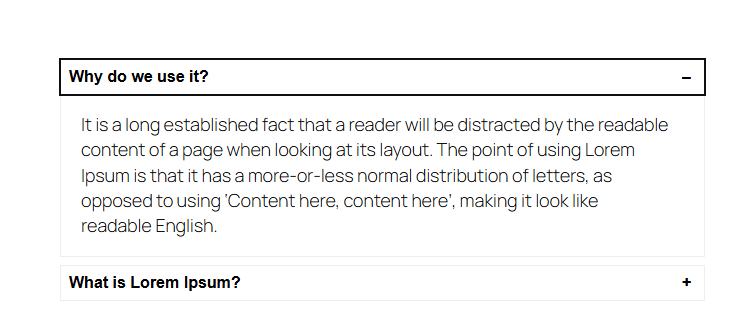
The Accordion Block allows you to organize and present information in collapsible sections, providing a clean and user-friendly way to display large amounts of content without overwhelming your visitors. This feature is perfect for FAQs, trip details, or step-by-step guides, enhancing both functionality and aesthetics on your website.
Accordion Options:
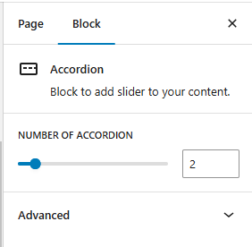
Number of Accordions: Define the number of collapsible sections to be included in the block.
Frontend View of the Accordion Block:
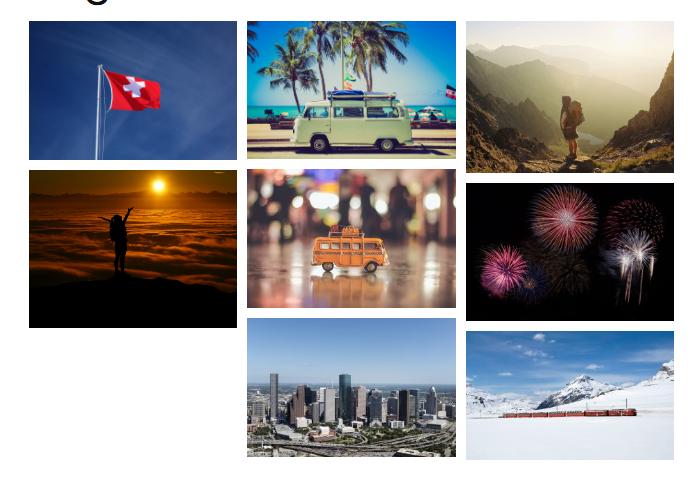
The Advanced Gallery Block is designed to showcase an image gallery with enhanced customization options, including layout flexibility, lightbox effects, and design control. It is perfect for creating visually appealing image displays on your site, whether for portfolios, travel photos, or featured images.
Advanced Gallery Options:
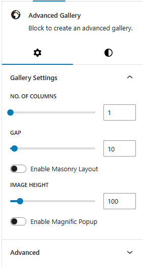
- Number of Columns: Choose the number of columns to organize images within the gallery. This can range from a single-column to a multi-column layout, providing flexibility based on screen size and aesthetic preference.
- Gap: Define the spacing between images, allowing for tight or spacious layouts according to the design style.
- Enable Masonry Layout: Activate a masonry layout to create a dynamic grid where images are arranged in a staggered pattern, ideal for images of varying heights and sizes.
- Image Height: Set a consistent height for images to ensure uniformity or create a specific visual style within the gallery.
- Enable Magnific Popup: Enable this option to display images in a Magnific Popup lightbox when clicked.
Frontend View of the Advance Gallery Block:
The Back To Top Block provides users with a convenient, floating button that allows them to quickly scroll back to the top of the page with a single click. This feature enhances site usability, especially on pages with long content, by offering easy navigation and a smoother browsing experience.
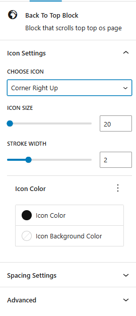
- Icon Settings:
- Choose Icon: Select from multiple arrow or chevron designs for the back-to-top icon, such as:
- Corner Right Up
- Arrow Up
- Corner Left Up
- Arrow Big Up
- Arrow Up From Line
- Square Arrow Up
- Circle Chevron Up
- Icon Size: Define the size of the icon for better visibility.
- Stroke Width: Adjust the thickness of the icon’s lines for a sharper or softer look.
- Icon Color: Set the color of the icon to ensure it complements your site design.
- Choose Icon: Select from multiple arrow or chevron designs for the back-to-top icon, such as:
- Spacing Settings: Control the button’s size and placement with spacing options:
- Border Color: Customize the color of the button’s border.
- Border Size: Set the width of the button’s border for a minimal or bold outline.
- Border Radius Size: Define the roundness of the button’s corners for a sharp or circular design.
- Padding: Adjust the spacing within the button to optimize its proportions.
Frontend View of the Back To Top Block:
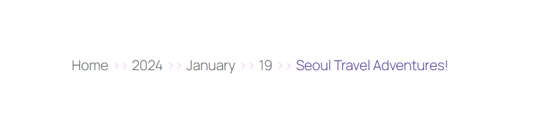
The Breadcrumb Block is a navigational aid that displays a breadcrumb trail, showing users their current location within the site’s hierarchy. This feature helps improve user experience by making it easier to navigate between pages and understand the site’s structure.
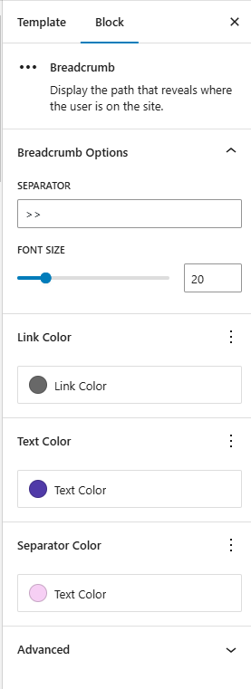
- Separator: Choose the character or symbol used to separate breadcrumb links. Examples:
>,/,|, or custom icons. - Font Size: Customize the font size of the breadcrumb text to ensure readability and consistency with the site design.
- Link Color: Define the color of breadcrumb links (clickable items) to distinguish them from static text.
- Text Color: Set the color of non-link text (e.g., current page name) for clarity and aesthetics.
- Separator Color: Customize the color of the separator symbol to complement the breadcrumb text.
Frontend View of the Breadcrumb Block:
The Counter Block is a visually engaging element used to showcase numerical data, such as statistics, milestones, or achievements, in an animated format. It grabs users’ attention and highlights important figures dynamically as they scroll.
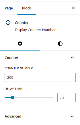
- Counter:
- Counter Number: The final number the counter will display (e.g., 100, 5000).
- Delay Time: Define how long (in milliseconds or seconds) the animation takes to reach the target number.
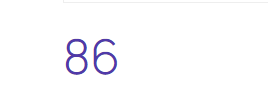
Frontend View of the Counter Block:
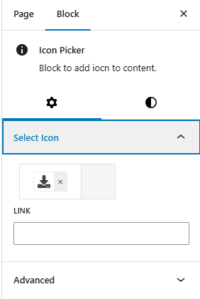
The Icon Picker block allows you to easily select and apply icons to elements on your site. It is a versatile tool for customizing content and design by offering a variety of icons to represent actions, features, or other elements.
- Select Icon: This option allows you to define the total number of stars in the rating. Typically, this is set to 5 stars, but you can customize it based on your preferences.
- Link: This option lets you define a URL for the icon to link to, making the icon clickable.
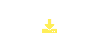
Frontend View of the Icon Picker Block:
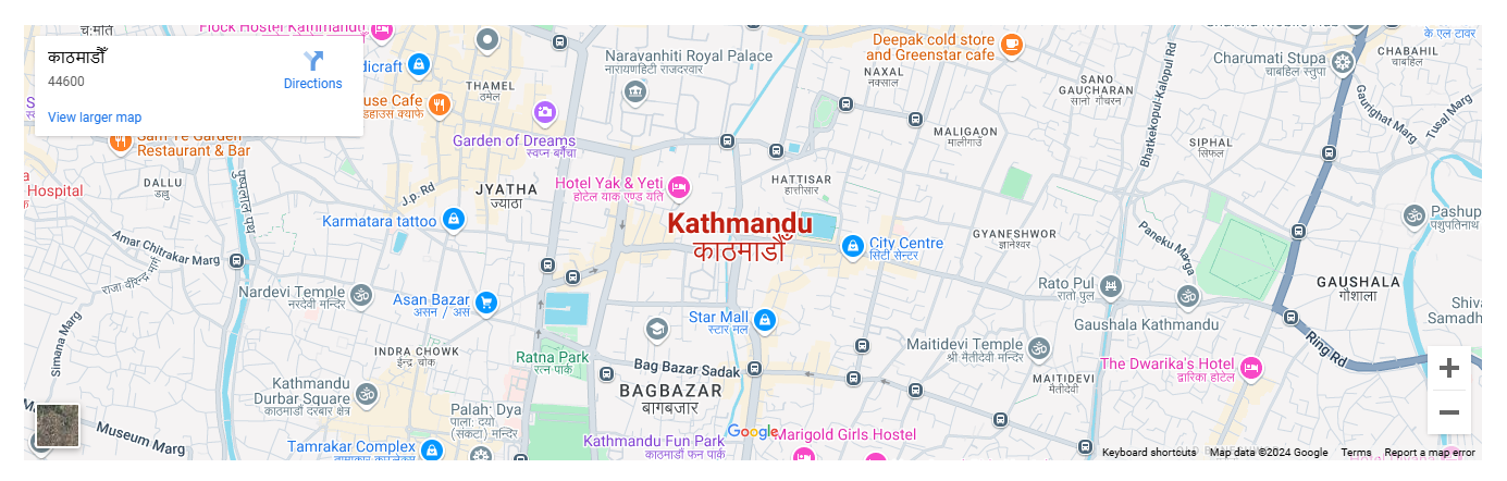
The Map Block allows you to display geographical locations interactively, providing a clear and engaging way for users to visualize destinations, routes, or landmarks. This block is ideal for travel websites, event pages, or any platform where showcasing a location is essential.
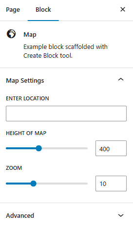
- Enter Location: Specify the location to be displayed on the map using an address or coordinates.
- Height of Map: Set the height of the map to fit seamlessly with your website’s layout.
- Zoom: Adjust the zoom level to focus on a specific area or provide a broader view.
Frontend View of the Map Block:
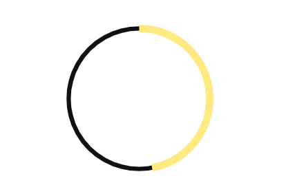
The Progress Bar Block is a dynamic and interactive way to visually represent the progress of a task, goal, or achievement. Perfect for tracking completion rates, milestones, or objectives, this block enhances user engagement by providing a clear visual representation of progress.
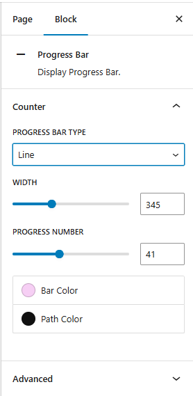
- Progress Bar Type:
- Line: A horizontal or vertical bar that fills based on progress.
- Circle: A circular design that progressively fills based on completion.
- Width: Set the total length of the progress bar for the line type and the diameter for the circle.
- Progress Number: Display the percentage value to visually indicate how much of the task or goal is complete.
- Bar Color: Customize the color of the filled portion of the bar to align with your website’s theme or highlight specific tasks.
- Path Color: Adjust the color of the unfilled or background portion of the progress bar for better contrast.
Frontend View of the Progress Bar Block:

The Separator Block is used to create a visual division between different sections of content. It helps improve readability by adding clear breaks in a layout. You can customize its style, width, and alignment to match the design. This block enhances the structure and flow of a webpage.
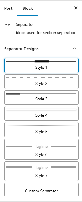
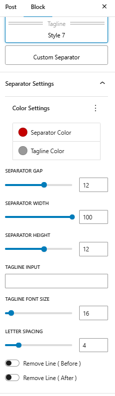
- Settings available in Separator Blocks:
- Separator Color: Define the color of the separator between elements.
- Separator Gap: Set the gap between the separator and other elements.
- Separator Width: Adjust the width of the separator.
- Separator Height: Set the height of the separator.
- Tagline Color: Customize the color of the tagline text.
- Tagline Input: Define the input text for the tagline.
- Tagline Font Size: Set the font size for the tagline.
- Tagline Letter Spacing: Adjust the letter spacing for the tagline text.
- Remove Line Before: Toggle to remove the line before the element.
- Remove Line After: Toggle to remove the line after the element.
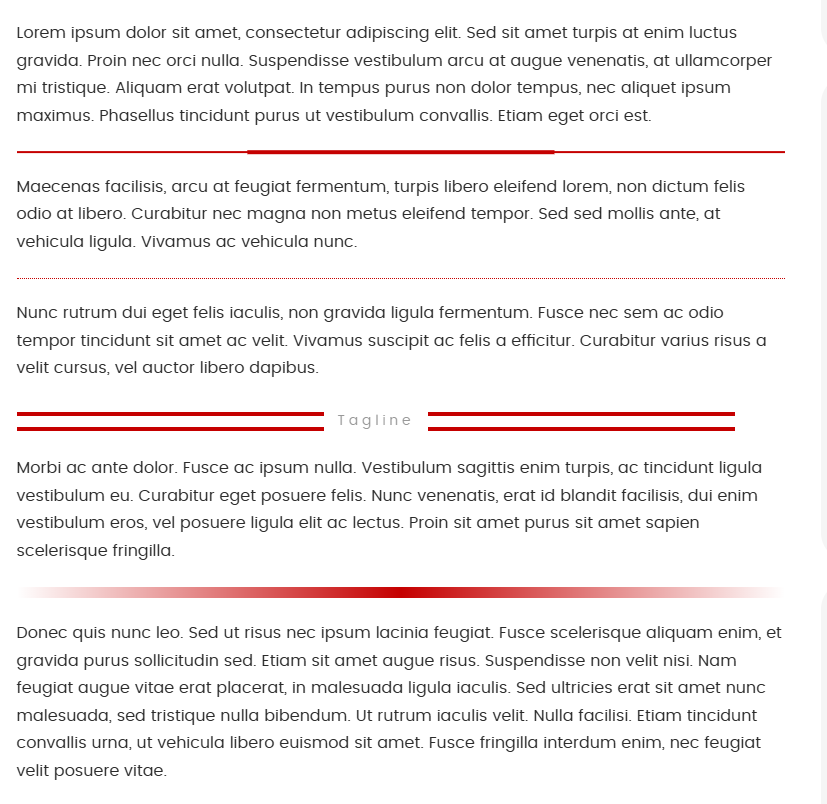
Frontend View of the Separator Block:
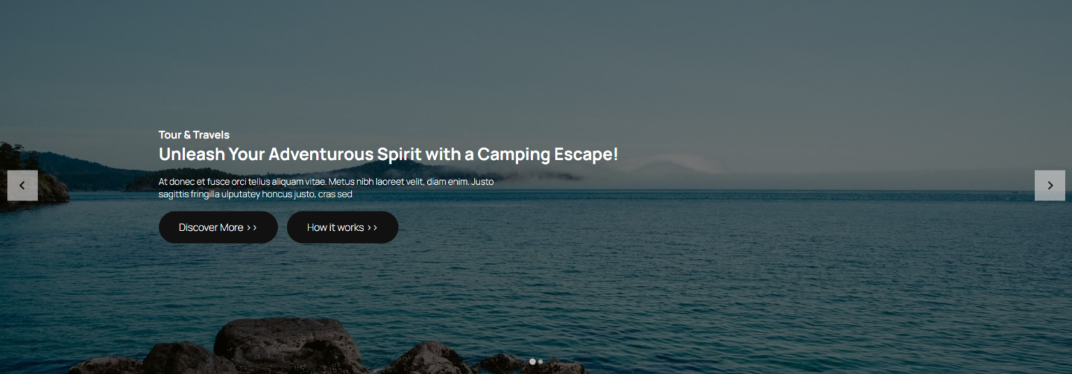
The Slider Block is a dynamic and customizable tool for creating visually engaging sliders. Perfect for displaying images, testimonials, trip highlights, or other content, it enhances user interaction while maintaining a clean and modern design.
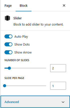
- Auto Play: Enable/Disable slides transition automatically.
- Show Dots: Display navigation dots at the bottom of the slider for quick navigation between slides.
- Show Arrow: Enable left/right navigation arrows for manual slide control.
- Number of Slides: Specify the total number of slides to include in the slider.
- Slides Per Page: Define how many slides appear simultaneously on the screen.
Frontend View of the Slider Block:
The Social Site Block adds social media share buttons to your site, allowing users to easily share your content across popular platforms. This block enhances user engagement and helps increase the visibility of your content.
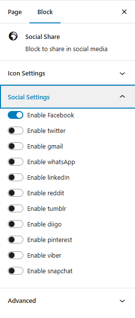
- Icon Settings:
- Icon Color: Customize the color of the social media icons.
- Text Color: Set the color for any accompanying text with the icons.
- Background Color: Choose the background color for each icon button.
- Border Color: Define the color of the icon borders.
- Icon Size: Adjust the size of each icon to fit your design.
- Font Size: Set the size of any text accompanying the icons.
- Border Size: Specify the thickness of the icon border.
- Border Radius Size: Adjust the roundness of the icon borders for a softer or more square appearance.
- Social Settings:
- Enable Facebook: Enable or disable Facebook.
- Enable Twitter: Enable or disable Twitter.
- Enable Gmail: Enable or disable Gmail.
- Enable Whatsapp: Enable or disable Whatsapp.
- Enable LinkedIn: Enable or disable LinkedIn.
- Enable Reddit: Enable or disable Reddit.
- Enable Tumblr: Enable or disable Tumblr.
- Enable Diigo: Enable or disable Diigo.
- Enable Pinterest: Enable or disable Pinterest.
- Enable Viber: Enable or disable Viber.
- Enable Snapchat: Enable or disable Snapchat.
Frontend View of the Social Share Block:

This block allows you to display a set of rating stars, which can be used to show user reviews or ratings for a trip or service.
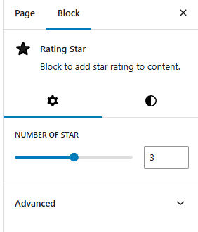
- Number of stars: This option allows you to define the total number of stars in the rating.
- Default: Typically, this is set to 5 stars.
- Customizable: You can customize it based on your preferences.
Frontend View of the Rating Stars Block:

The Text Marquee Block displays scrolling text, perfect for announcements, promotional messages, or news updates. This block adds continuous movement to your site, helping capture attention and deliver key information effectively.
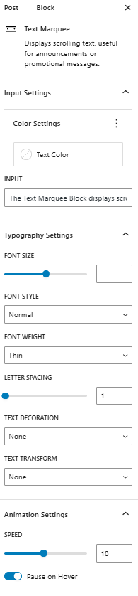
- Input Settings:
- Color Settings:
- Text Color: Customize the color of the text.
- Marquee Text: Customize the color of the marquee text.
- Color Settings:
- Typography Settings:
- Font Size: Set the font size for the text.
- Font Weight: Define the weight of the font (e.g., bold, normal).
- Letter Spacing: Adjust the spacing between letters in the text.
- Text Decoration: Set the decoration style for the text (e.g., underline, none).
- Text Transform: Define the text transformation (e.g., uppercase, lowercase).
- Animation Settings:
- Speed: Set the speed of the animation.
- Pause on Hover: Toggle to pause the animation when hovered over.
Frontend View of the Text Marquee Block:

The Loader Block provides a dynamic visual indicator that enhances the user experience by showing a loading animation or progress indicator while content or elements are being loaded. This feature is ideal for improving user engagement during slow-loading pages or processes.
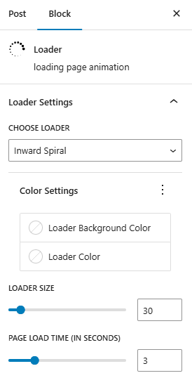
- Loader Settings:
- Choose Loader: Select the loader type for your page.
- Color Settings:
- Loader Background Color: Set the background color of the loader.
- Loader Color: Customize the color of the loader itself.
- Loader Configuration:
- Loader Size: Define the size of the loader.
- Spinner Width: Adjust the width of the spinner.
- Page Loader Time: Set the page loader time in seconds.
Frontend View of the Loader Block:

The Video Popup Block provides a clean and interactive way to showcase videos on your site by displaying them in a lightbox-style popup. This feature is ideal for attracting attention to promotional content, tutorials, or featured video content.
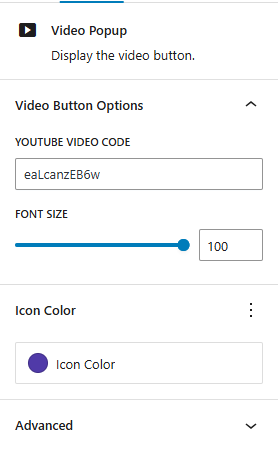
- YouTube Video Code: Enter the unique YouTube video code to embed the video directly in the popup. This code is the part of the URL after
https://www.youtube.com/watch?v=, making it easy to add YouTube videos by pasting only the video ID. - Font Size: Define the font size for any text within the popup, such as titles or captions.
- Icon Color: Customize the color of the play button or icon used to trigger the popup, helping it stand out on your page.
Frontend View of the Video Popup Block