

Home › Forums › Pro Themes › Education Hub Pro › Responsive design question
Tagged: header image in mobile version
- This topic has 3 replies, 2 voices, and was last updated 9 years, 10 months ago by
wensolutions.
-
AuthorPosts
-
September 21, 2016 at 11:21 am #18348
mlevine3@esu.edu
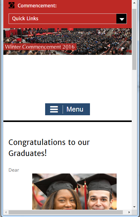
MemberFor Mobile view:
There is a large white space between the header and menu. Can that be removed?
The two images in the body of the text appear after the word “Dear”. Can the images be moved below the text or removed?
Screenshot: http://www.esu.edu/images/wordpress/education1.jpg
Main Site: http://quantum.esu.edu/test_theme/
September 22, 2016 at 1:52 am #18383wensolutions
KeymasterHello @mlevine3@esu.edu
To fix the issue in mobile version you need to add custom CSS.
For this you need to go to Admin Panel / Appearance / Customize / Theme Options / Advanced Options.
Here you need to copy and paste following CSS.#masthead { background-position: inherit; } @media only screen and (max-width: 767px) { .site-header { padding: 0; } } @media only screen and (max-width: 767px) { .site-header { padding: 0; } } @media only screen and (min-width : 320px) and (max-width : 568px) { .site-header { min-height: 70px; } } @media only screen and (min-width : 375px) and (max-width : 667px) { .site-header { min-height: 80px; } } @media only screen and (min-width : 414px) and (max-width : 736px) { .site-header { min-height: 90px; } } @media only screen and (min-width : 768px) and (max-width : 1024px) { .site-header { min-height: 160px; padding: 0; } #masthead { background-position: center; background-size: cover; } }Hope this will help you.
Let us know how it goes.Regards!!!
September 22, 2016 at 8:36 am #18466MemberOk, your CSS took care of the white space (thank you). However the 2 images still appear after the word “Dear”. I would like the option of either removing images on mobile or at the very least have the image move below the text.
September 23, 2016 at 12:15 am #18558KeymasterHello,
Please add the below given CSS to
Dashboard -> Appearance -> Customize -> Theme Options -> Advanced Options
@media screen and (max-width: 768px){
	body.home .entry-content img {
	    display: none;
	}
}
Hope it helps.
Best regards. -
AuthorPosts
- You must be logged in to reply to this topic.


